September 12, 2026 · 20 min read
Copy Ready Captioning Style Tokens for Production Teams
Accessibility first captioning rules production teams can copy and paste: two line limits, 180 wpm timing, speaker labels, and a live caption workflow...

A captioning style guide has to make captions accurate, readable, and consistent. At minimum, that means two lines maximum per caption, a sans serif font, timing that remains synchronized with the audio, and explicit labels for speakers and non-speech sounds. Anchor these rules against Section 508 and the DCMP Captioning Key, and the rest of this guide walks through exactly how to apply each one.
TL;DR:
Captioning style guides ensure captions are consistent, accurate, and synchronized, with a maximum of two lines per caption and clear speaker labels.
Punctuation rules require sentence-ending punctuation to trigger new captions, with mixed case defaulting to lowercase and special symbols like ellipses and em dashes used appropriately.
Captions should use sans serif fonts, high-contrast backgrounds, and be placed at the bottom of the frame, avoiding manual line breaks on platforms that auto-reflow captions.
Timing guidelines dictate captions stay on screen at least two seconds and do not exceed roughly 180 words per minute to maintain readability.
For live captioning, domain-specific AI tools like Live Caption AI add punctuation and smart formatting automatically and translate into one of 29 languages per session.
Table of Contents
-
What Is a Captioning Style Guide, and What Does It Actually Cover?
-
Punctuation, Capitalization, and Number Rules for Clean Captions
-
Font, Color, Contrast, and Placement Rules for Legible Captions
-
How Fast Should Captions Move, and How Do You Keep Them Synced?
-
Which Tools Handle Different Parts of the Captioning Workflow?
-
Why a Consistent Style Guide Matters More Than People Assume
What Is a Captioning Style Guide, and What Does It Actually Cover?
A captioning style guide is the rulebook that keeps every caption your team produces looking and behaving the same way, regardless of who edited it or which project it belongs to. Without one, you get inconsistent line breaks, random capitalization choices, and speaker labels that mean something different in every video. That inconsistency isn’t just sloppy. It actively hurts comprehension for the deaf and hard-of-hearing viewers captions exist to serve.
The guide rests on five accessibility goals, all drawn from the Captioning Key published by the Described and Captioned Media Program:
-
Accurate: captions match the spoken content with correct spelling and grammar.
-
Consistent: styling choices, from punctuation to speaker tags, stay identical across every video in your library.
-
Complete: captions run for the full duration of the program, including credits and asides.
-
Clear: sound effects and speaker changes are identified so context isn’t lost.
-
Equal: the caption experience should give a deaf or hard-of-hearing viewer the same information a hearing viewer gets, not a stripped-down version.
Each goal changes real editorial decisions. “Equal” is why you caption a phone ringing off-screen instead of skipping it. “Complete” is why you don’t cut the outro monologue just because it’s talking over music.
One policy choice sits above the rest: verbatim versus edited captions. Verbatim captioning keeps every “um,” repetition, and false start, which matters for legal depositions, medical consultations, and anywhere exact wording carries legal weight. Edited captioning cleans up disfluencies for smoother reading, which fits most entertainment, marketing, and educational content. Section 508 doesn’t mandate one over the other, but it does require whichever you choose to preserve meaning and grammar accurately. Pick one policy per content category and write it into your guide so editors stop guessing project by project.
Punctuation, Capitalization, and Number Rules for Clean Captions
Punctuation in captions does more work than it does in regular prose because it’s often the only cue a viewer gets that a new thought, speaker, or pause has started. Broadcast style guidance from the NCRA recommends starting a new caption line right after sentence-ending punctuation rather than mid-sentence, which keeps each caption a complete, digestible thought.
Here’s the core rule set:
-
End punctuation (periods, question marks, exclamation points) typically triggers a new caption card.
-
Ellipses show a trailing pause or a thought that trails off: “I just thought maybe…”
-
Em dashes mark an interruption or an abrupt topic change: “I was going to say something, but she cut me off.”
-
Mixed case is the default. Reserve ALL CAPS for genuine shouting or an on-screen sign being read aloud, never for emphasis.
-
Numbers: spell out one through ten, use numerals for numbers above ten. Technical, scientific, or measurement contexts (dosages, timestamps, scores) get numerals regardless of value.
-
Times and dates follow standard written conventions: “3:00 PM,” “March 12, 2026,” never abbreviated into ambiguous shorthand.
Filler words need a judgment call tied to your verbatim policy. In edited captions, drop most “uh” and “um” unless the hesitation itself carries meaning, like in a courtroom deposition. Stuttering or fragmented speech should be represented lightly, enough to convey the speaker’s state without turning the caption into a transcription exercise that’s harder to read than the original speech.
Pro Tip: Write your punctuation rules once as a one-page reference sheet and pin it above your caption editing software. Editors who have to remember rules instead of checking them will drift within a week.
Font, Color, Contrast, and Placement Rules for Legible Captions
Legibility rules aren’t a matter of taste; following a clear video SEO guide ensures your captions enhance accessibility and boost your video’s organic reach. The DO-IT caption guidelines from the University of Washington recommend sans serif fonts like Helvetica or Arial because their uniform stroke width holds up at small sizes and low resolutions, unlike serif fonts, which blur on compressed video.
Build your visual spec around these points:
-
Font: sans serif only, medium to bold weight, sized large enough to read on a phone screen at arm’s length.
-
Background: a translucent gray or solid black box behind the text outperforms plain text with a drop shadow, especially over busy footage. Run your color choices through a contrast checker like WebAIM’s tool before locking a palette.
-
Line limit: two lines maximum, matching the standard set by the University of Melbourne’s style guide.
-
Placement: default to the bottom of the frame. Move captions to the top only when bottom-of-frame text or graphics would otherwise be covered.
One caveat that trips up a lot of teams: if you’re delivering to a platform like YouTube or a streaming service that renders captions through its own player, don’t manually force line breaks. The platform’s own reflow logic will often fight your formatting, producing three-line captions or awkward breaks you didn’t intend. Test on the actual delivery platform, not just your editing software’s preview window.
How Fast Should Captions Move, and How Do You Keep Them Synced?
Timing is where most amateur captioning falls apart, even when the text itself is accurate. The UCOP accessibility guidelines set two hard numbers worth memorizing: captions should be displayed on-screen long enough to be read comfortably, and reading speed shouldn’t exceed roughly 180 words per minute, or about three words per second.
Follow these steps to hit that target consistently:
-
Chunk sentences at natural clause boundaries, not arbitrary character counts, so each caption reads as one complete thought.
-
Shorten text before you speed up display time. If a line is too dense to read in two seconds, trim wording first. Only compress the timing window as a last resort.
-
Segment overlapping dialogue into sequential captions rather than cramming two speakers into one card, and label the overlap when both voices matter to the scene.
-
Handle music lyrics and rapid-fire dialogue with shorter, more frequent captions rather than one long block that outruns the reading rate.
-
Test playback at 0.75x and 1.25x speed, and check the result on both mobile and desktop. Viewers rarely watch at exactly 1.0x, and captions that sync perfectly at normal speed can drift when a viewer slows down a tutorial or speeds through a lecture.
Section 508 guidance reinforces the same principle from the compliance side: captions must stay synchronized with audio and remain on-screen long enough to be read, not just technically present.
Formatting Speaker Labels and Non-Speech Sound Descriptions
Consistency here matters more than the specific format you choose, as long as you pick one and stick to it across every project. Whether you label speakers with a colon (“MARIA: I don’t think so.”) or with the name in parentheses on its own line, apply the same convention to every video in your catalog.
-
Use a separate line with the speaker’s name when multiple people speak in quick succession, so viewers can track who’s talking without confusion.
-
Format sound effects and music with square brackets and objective language, not interpretive language: “[background laughter]” and “[classical string music]” work; “[eerie tension building]” does not, because it inserts an emotional judgment call the viewer should form independently.
-
Label unclear audio honestly with “[inaudible]” or “[unintelligible]” rather than guessing at a plausible line of dialogue.
-
Keep descriptions objective, never inferred. Describe what’s heard, not what the editor assumes the speaker is feeling.
The DCMP Captioning Key treats speaker identification and non-speech description as core to the “equal” and “complete” goals covered earlier. Skip them, and a hearing-impaired viewer misses plot-critical information a hearing viewer picks up automatically.
Open vs. Closed Captions, and Pop-On vs. Roll-Up Rendering
Open captions are burned directly into the video and can’t be turned off. Closed captions are a separate track the viewer toggles on or off, which is what most broadcast and streaming platforms use by default. Open captions sometimes need different placement and higher contrast because they can’t rely on a platform’s built-in caption styling engine to guarantee legibility.
Pop-on captions display a full caption block at once and disappear as a unit, which is the standard for most pre-produced video since it gives editors full control over line breaks and timing. Roll-up captions scroll line by line, which is common in live broadcast because it’s easier to generate in real time from a continuous speech feed.
-
Live captioning accepts looser timing precision but needs strict, simple speaker-label conventions since there’s no time to second-guess formatting mid-broadcast.
-
Post-production captioning can be edited repeatedly to hit the reading-rate target exactly, since there’s no live pressure.
-
Avoid hard line breaks when delivering to a platform that reflows captions automatically. Manual breaks often get overridden anyway, and fighting the platform wastes editing time.
A Copy-Paste Checklist and Style Token Set for Your Team
Consistency across projects is what actually cuts QC time, and small copy-ready tokens are the fastest way to get a team to follow a guide instead of improvising. Here’s a starter checklist:
-
Two lines max per caption card, broken at clause boundaries.
-
Sans serif font on a translucent or solid background box.
-
Minimum two seconds on-screen; target ~180 wpm reading rate.
-
Speaker label format locked to one convention (colon or parenthetical) for the whole project.
-
Non-speech sounds in square brackets, written objectively.
| Style Element | Standard Token |
|---|---|
| Line limit | 2 lines max |
| Font | Sans serif (Helvetica/Arial style) |
| Minimum duration | ~2 seconds |
| Reading rate target | ~180 wpm (~3 words/sec) |
| Speaker label | Colon or parenthetical, one style per project |
| Non-speech sound | [bracketed, objective description] |
Run a three-step QA pass before publishing: check timing against the reading-rate target, check every speaker and sound label against your chosen format, then check line breaks at both the fastest and slowest playback speeds you support. That last check catches the drift issue covered in the timing section above.
How a Live Captioning Tool Puts These Rules Into Practice
Style rules only matter if the delivery tool can actually enforce them in real time, which is a harder problem for live events than for edited video. Live Caption AI delivers live captions to any attendee’s phone through a QR code, with domain-specific accuracy models tuned for the terminology.
A session configured against a style guide like this one typically checks:
-
Two-line display limits enabled on the receiving device.
-
Speaker tagging turned on for multi-speaker settings like panels or church services.
-
A quick on-device test run before the audience connects, checking font legibility on an actual phone screen, not just a laptop preview.
-
A backup workflow in place in case connectivity drops mid-session.
Teams researching assistive captioning technology or looking to caption live events reliably will find these checks map directly onto the rules already covered above.
How Do You Handle Multiple Languages and Translations?
Multilingual captioning adds a layer most style guides skip until it becomes a problem mid-project. The core rule: treat each language as its own caption track with its own timing pass, not a straight text swap over the original English timing.
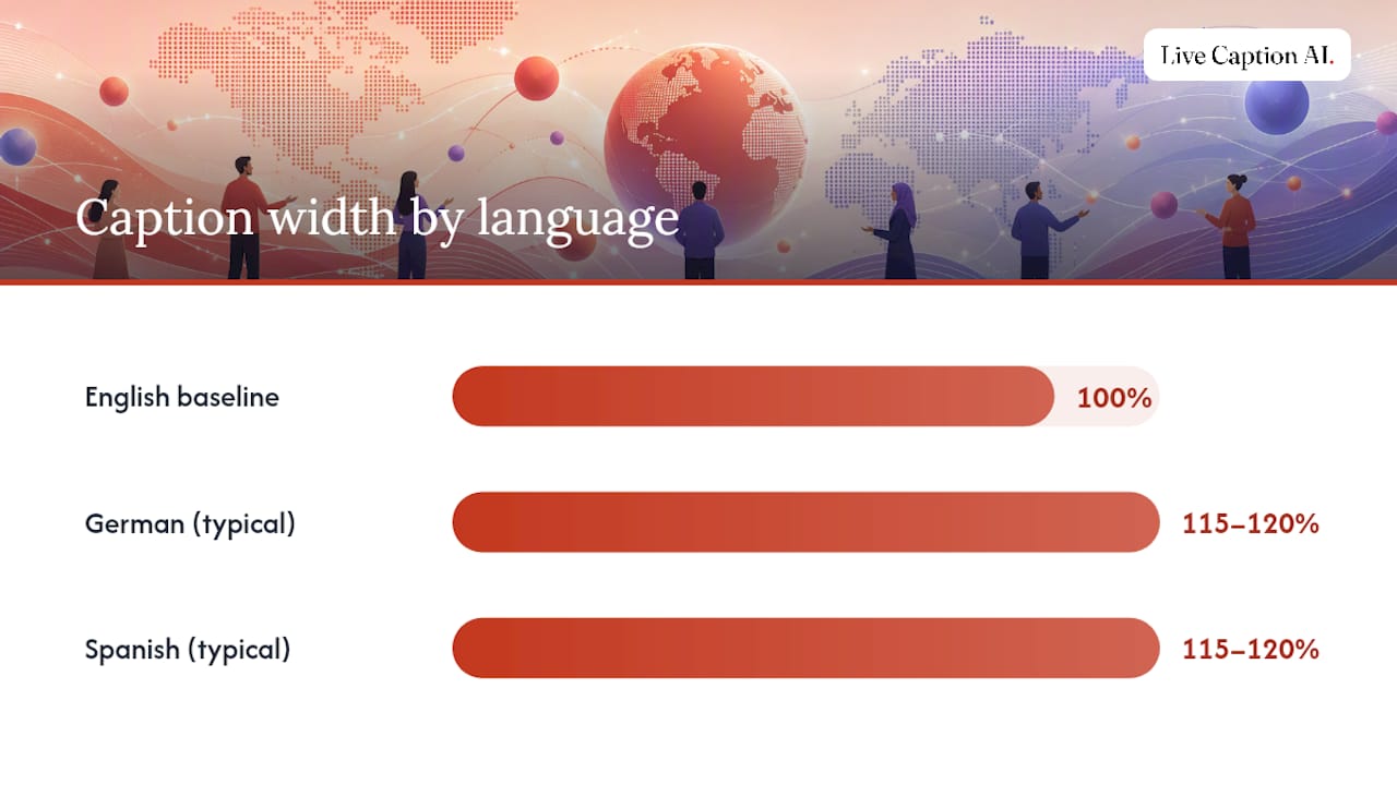
Translated text often runs longer or shorter than the source language. German and Spanish frequently need 15 to 20% more horizontal space than English for the same sentence, which breaks a caption card that fit perfectly in the original language. Re-chunk the translated line at its own clause boundaries rather than forcing it into the English caption’s line breaks.
Keep a few practical rules consistent across every language track:
-
Speaker labels and bracketed sound descriptions should be translated too, not left in English, since a viewer reading Spanish captions shouldn’t hit an English “[background laughter]” mid-sentence.
-
Reading-rate targets shift by language. Character-dense languages like Chinese or Japanese need slower per-character display timing even at the same word count, so don’t assume the ~180 wpm English benchmark from the timing section translates directly.
-
Punctuation conventions differ. Spanish uses inverted question marks at the start of a question; some Asian languages don’t use spaces between words the way English does. Don’t force English punctuation habits onto a translated track.
For events with a live, multilingual audience, real-time translation adds synchronization pressure on top of everything already covered in the pacing section: the translated caption has to land close enough to the original speech that a bilingual viewer switching between tracks doesn’t notice a lag. Teams building out live translated caption workflows for US audiences run into this exact tradeoff between translation accuracy and delivery speed.
When Should You Use Italics or Bold in Captions?
Italics and bold aren’t decorative in captioning. Each one carries a specific, standardized meaning, and mixing that up confuses viewers who’ve learned to read captions as a semantic system, not just styled text.
Italics signal one of a few specific situations:
-
Off-screen or off-camera speech, like a narrator or a voice coming from another room.
-
Song lyrics or music, often paired with a musical note symbol.
-
A word spoken in a foreign language within an otherwise English sentence.
-
Titles of books, movies, or shows mentioned in dialogue, following standard written-English convention.
Bold sees far less standardized use in captioning than italics. Some style guides reserve it for on-screen text call-outs or critical safety information; most avoid it entirely for regular dialogue, since captions already work hard to stay uncluttered. If your project doesn’t have a specific reason to bold text, skip it.
The temptation to use formatting for emotional emphasis, bolding a shouted word or italicizing a sarcastic line, should be resisted. That’s the same principle covered earlier with non-speech descriptions: captions describe, they don’t interpret. If a line is shouted, the audio and, where appropriate, capitalization convey that. Adding bold on top layers a subjective judgment onto what should be an objective transcript.
Keep your formatting rules on the same one-page reference sheet as your punctuation tokens. A caption editor juggling five style decisions per line needs those rules visible, not memorized.
How Should Captions Handle Slang, Dialects, and Profanity?
Slang and dialect should be captioned as spoken, not smoothed into standard English. If a speaker says “gonna” or “y’all,” write it that way. Correcting it to “going to” or “you all” misrepresents the speaker’s actual voice and can strip meaningful cultural or regional context from an interview or documentary.
Regional dialect presents a harder edge case. The goal is representing speech accurately without veering into caricature or making a dialect harder to read than necessary. When in doubt, prioritize the words a viewer would recognize if they heard the audio, rather than a phonetic spelling that draws attention to itself.
Profanity gets captioned as spoken in most editorial and documentary contexts, since editing it out misrepresents what was actually said and can even change the tone of a scene. Broadcast and platform-specific content restrictions sometimes require bleeping or asterisking; when that’s the case, the caption should match whatever the audio track actually contains; if the audio is bleeped, the caption reflects that with a bracketed note like “[expletive bleeped]” rather than spelling out the censored word. Your organization’s own content policy, not a universal captioning rule, should dictate where that line sits for sensitive audiences, particularly educational or children’s content.
What Legal and Compliance Rules Apply to Captioning?
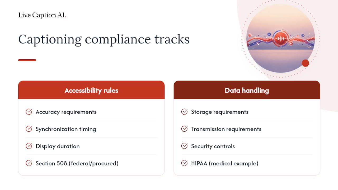
Captioning compliance in the US runs through a few overlapping frameworks, and knowing which one applies to your content changes what “acceptable” actually means. The Section 508 standards apply to federal agencies and any content or technology procured by them, setting baseline requirements for synchronization, accuracy, and display duration.
Beyond federal procurement, the Americans with Disabilities Act (ADA) has been applied by courts to require captioning for places of public accommodation, including many streaming platforms, educational institutions, and public-facing events, though the exact scope continues to be shaped by ongoing litigation rather than one single bright-line rule. Higher education specifically leans on accessibility offices, and university guides like UCOP’s and Colorado’s accessibility resources translate those legal obligations into classroom-usable rules for course video.
None of this replaces legal counsel for your specific organization and jurisdiction, but the pattern holds across contexts: accuracy and synchronization rules come from accessibility standards bodies, while data handling rules come from whatever regulatory framework covers your industry. Treat them as two separate compliance checklists, not one.
Which Tools Handle Different Parts of the Captioning Workflow?
No single tool covers every stage of captioning well, so most production workflows stitch together a few specialized ones. For automatic speech-to-text generation on pre-recorded video, cloud transcription services provide a fast first draft that still needs a human editing pass against the style rules covered throughout this guide, particularly around punctuation, speaker labels, and line breaks.
For manual caption editing and precise timing control, dedicated caption editors let you adjust in and out points frame by frame, which matters most for pop-on captions where exact timing is part of the polish. These tools typically export to standard formats like SRT or VTT, which most platforms accept directly.
For live events, the tooling requirement shifts entirely. Real-time speech-to-text needs low latency and domain awareness, since generic transcription engines routinely mangle medical terminology, legal vocabulary, or organization-specific names that never appear in general training data. This is where a purpose-built live captioning platform earns its keep over a general transcription app, since domain-specific accuracy directly determines whether attendees get usable captions or a stream of garbled proper nouns.
Whatever combination your team settles on, run new tools through the same checklist from the implementation section above before deploying them on a real event or publication, since a tool’s default output rarely matches a house style guide out of the box.
Why a Consistent Style Guide Matters More Than People Assume
The real payoff of a captioning style guide isn’t polish. It’s the hours it saves in QC every single week, and the trust it builds with viewers who rely on captions rather than treating them as an afterthought. A team that documents its rules once stops relitigating punctuation and speaker-label decisions on every new project, which is where most caption quality actually erodes over time. Consistency is what turns accessibility from a checkbox into something viewers can actually depend on.
— Ryan
Get Live Captions That Already Follow the Rules
Live Caption AI is the alternative to hiring a stenographer or renting captioning hardware for your next event: it turns any attendee’s own phone into a caption receiver through a simple QR code, with no equipment rental and no per-session stenographer bill running into the hundreds of dollars.
Plans often include a free tier for basic on-device captions and paid tiers unlocking cloud-based features, unlimited device broadcasting, and exportable transcripts, often at costs lower than typical stenographer session fees. If your team needs captions that stay synchronized, support multiple languages, and hold to a consistent style without hiring outside help, start a trial on the Live Caption AI website and test it on your next live session.
Where These Style Rules Come From
These rules draw from Section 508’s federal captioning guidance, the DCMP Captioning Key, university accessibility resources including UCOP and Melbourne’s style guide, and design references like the U.S. Web Design System.
Sources
FAQ
What Are the Different Styles of Captions?
The two primary types are open captions, permanently burned into the video, and closed captions, which viewers can toggle on or off. Within closed captions, pop-on captions display full blocks at once while roll-up captions scroll line by line, a style common in live broadcast.
What Is CC1, CC2, CC3, and CC4 Closed Captioning?
CC1 and CC2 are the original NTSC closed caption channels, with CC1 typically carrying primary-language captions and CC2 sometimes used for a secondary language or supplemental data. CC3 and CC4 extended that same structure for additional language tracks, though most modern digital captioning workflows have moved past this legacy channel system entirely.
How Should Captions Be Formatted?
Captions should run no more than two lines, use a sans serif font on a high-contrast background, stay synchronized within about two seconds of the audio, and label speakers and non-speech sounds consistently, as covered in the visual presentation section above.
What Is the Proper Format for Writing Subtitles?
Subtitles follow the same core formatting rules as captions, two lines maximum, clause-based line breaks, and a reading rate near 180 words per minute, but they typically translate dialogue only and skip non-speech sound descriptions since subtitles usually target viewers who can hear the audio but don’t understand the spoken language.
Can Live Captioning Tools Follow a Style Guide Automatically?
Live captioning tools handle timing and speaker separation automatically, but full style-guide compliance still depends on configuration. A platform like Live Caption AI supports domain-specific accuracy and speaker tagging, which covers much of the formatting groundwork, though line-limit and punctuation display still depend on the receiving device’s settings.